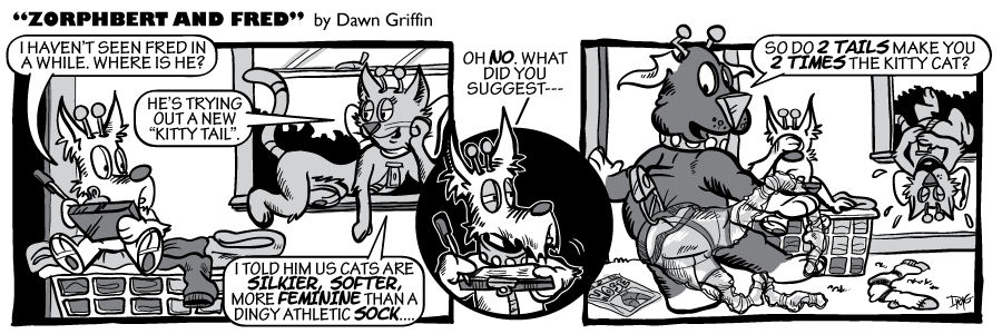
Every once in a while I like to bring up the kitty tail again.. remind readers why Fred often has a sock pinned to his butt.
The artwork on this one I really tried to keep as simplified as possible. It’s an ongoing goal of mine to be able to increase my update frequency… which is harder and harder as of late due to the kids book series and my upcoming wedding. However, if I can find a way to cut back on the artwork detail, without losing too much of the quality I desire, then by the time the wedding planing chaos has subdued, I’ll be able to update.. hopefully.. THREE times a week. Yeah, 5 days would be wonderful, but honestly.. that’s not happening.
 Z&F Volume 1:
 Z&F Volume 2:
 Z&F Volume 3:
 BRAND NEW Z&F Volume 4:


I don’t mean to injure your artistic pride, but the drop-off isn’t really a big deal. Certainly, the detail is noticeably less, but that might actually be a good thing. Outside of the obvious time-investment factor, of course. Your unique style and talent as an artist will be enough to make “less” work for you.
hey, if the difference is minimal to my readers, that’s all that matters! This was a fist attempt, I may simplify more as I go, we’ll see.
I’ve known since college that I tend to over-do my artwork. Even as a graphic designer, I usually overload my project and then pair it down as revisions roll in.. until it’s a well balanced piece in the end. I JUST did exactly that with an ad today!
Aaaaah, come on Fred, really.
LOL, great page.
CyberDog out.
you’re thinking he should have gone with fish nets too?
It’s less, but still you. It’s not like you went totally barren here… there’s still the bush silhouette out the window (you could drop that and not effect the comic at all), you still have your famous hash marks on your characters (don’t lose that). Actually, you have so much detail on Fred’s double tail (hose) it is a bit hard to see. You asked for input (not really) and I’m hopefully helping.
Hey, you do great work and I know you want to have a consistent update schedule and still maintain a “normal” life. It’s hard. I feel your pain as I finish up comics at 2:00AM sometimes then try to get web-design work done the next day. Oh yeah, baby, that’s fun!
Good stuff, Dawn! It’s a step in the right direction I think!
🙂
The hose was difficult! It’s partially transparent, so I wanted to imply that… but hose are usually very crumpled and lose definition, so I wasn’t sure if readers would know what they were. I spent at least a 1/3rd of my time drawing the damn hose!
Thanks Byron.. I think all in all, this took an hour less. Helps.
Is that a run in your hose dear…no IT’S THE DOG!!!
I HATE it when that happens. SO unbecoming.
I think you’re on to something here, dawn. Heck, I think you could even go simpler and have an impact. Don’t get me wrong, your environments are very well done and beautiful to look at but sometimes TOO much distracts from your main characters and the point they’re trying to get across. kudos!
Thanks Wit, I agree.. and as I told derelict above… I tend to go overboard. Maybe if I get done w/ my work too fast I think I could have tried harder. Or, the more stuff I add, the better the comic, the more of a readership I’ll bring in. I even will toss in a “consolation” punchline if I doubt the original was as funny as I thought. I hear criticisms of other cartoonists for not having backgrounds or enough angles or variety… and then I fear that I’m falling into that myself and add in 10 extra bushes and a tree slug, for good measure ;0)
As someone with one of the most minimalist strips out there (besides that stickman one of course), I think it looks fantastic. There’s still tons of details and you’re such an amazing artist that I agree with Mike…you could strip down even more if you wanted to. I don’t think you need to, though. The strip still looks fantastic
Purrrrfect!
heh, nothing wrong with that. i generally keep gns to about an hours worth of work.
Your new style looks nice, Dawn. It’s very crisp and clean. 🙂