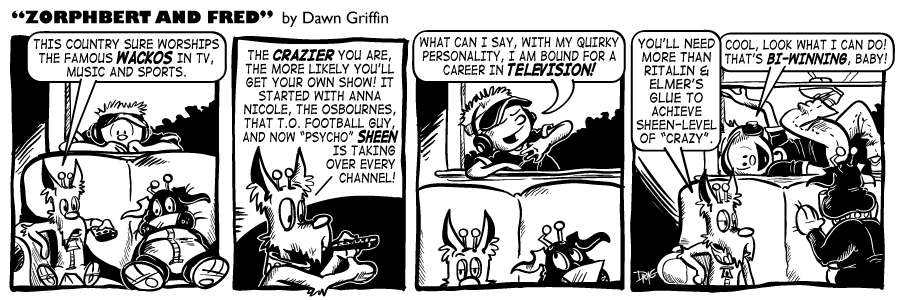
Well, I’m not huge into celebrity news or anything, but Charlie Sheen has made enough of a spectacle of himself, he’ll even end up in a Z&F comic. He’s either truly beyond insane, or a brilliant Hollywood business man, I cannot decide which.
Also, this is how Z&F would look in straight black and white. I have never done it before, actually. Giving it a shot, mostly because I am still coughing up a lung over here, and don’t have time to add grays. Thoughts? Do you miss the gray tones?
 Z&F Volume 1:
 Z&F Volume 2:
 Z&F Volume 3:
 BRAND NEW Z&F Volume 4:



Apparently, no one can escape the black hole that is Charlie Sheen’s insanity. I just finished penciling a comic that mentions him.
I hate the fact that he acts like a moronic turd and gets all this attention, but such is the entertainment protocol in this country. We reward the idiots with TV ratings.
Very true. Nothing beats watching a train wreck, it seems.
So Zorphbert is white and Fred is black. *refrains from starting trouble*
I like the starkness of black and white. It’s more eye-catching this way. So sayeth I, anyhow.
ha ha, well yea.. obviously nothing racist was intended by the colors I picked. Fred is a dark brown with a white tummy & paws… so just to add some interest (rather than making them both white), I made him black. I agree it looks odd. I have always admired awesome comics that aren’t afraid to go with straight B&W lineart… doing so much with so little amazes me.
I’m not decided if I should stick with it or not. Different is not always better, nor is it lacking or worse.
I have to say, I do miss the gray tones, but I will take my Z&F any way I can get it! I’m sorry you don’t feel well. Maybe it’s because you don’t have Tiger Blood and Adonis DNA (yeah, that’s right – I’m on that Crazy Train with Ozzy and Charlie)…
P.S. – derelict, I liked it!
ok, as I said.. I’m not one to follow celeb magazine or whatever, so I have no idea what the tiger blood thing means. Off to the googles! Actually, I’m not even sure where “bi-winning” means, I just figure it’s as insane as Charlie is now.
Thanks for your opinion, Winnie! I kind of miss the graytones myself, but I’m trying to figure out if I miss it only cuz it’s different, or if it just really is lacking.
Fred looks a little odd black, but I like the overall look of things in black and white.
Thanks Vince.. getting used to Fred in black as well. Maybe I’ll try the next one with Fred in white… or use a stipple pattern swatch, like in the old newspaper comics. classic!
It does seem to shave off about 20 mins, with just lineart.
There’s something about stark black and white that I’ve always loved. I was rereading Calvin and Hobbes the other day for the first time in forever, and again I noticed that there were never any gray tones. It’s tough knowing how to place harsh, solid blacks in a b/w composition and I really liked the look of this strip. But that’s just me. It’s nice to see this outside of a Frank Miller Sin City comic.
I know what you mean! Love C&H (obviously), and I admire how he could do much with just lineart. I tend to over-do everything… white space must be filled! Not sure why, maybe I feel as though I’m not putting enough effort into it if I don’t color, or add grays, or crosshatch, etc etc…
Maybe this exercise will force me to pair down and see how good my comic can look in just B&W!
Everyone has their own style, for me, less is more. Go through my archives and I’ve tried a gazillion different things. The cleaner and less cluttered each panel is, the more you can focus on the characters themselves. Make the props and backgrounds and aesthetics as minimal, but as needed as possible and see how you like that. You can draw, thats not in question, nor should it be from where you sit. The question is, what is aesthetics pleasing and best compliments your style? If your going black and white, less is def. more. Grayscale and color gives you more leeway with the eye candy in the background.
Thats 2.5 cents, worth less where applicable! *smirk*
I like it, Dawn. It shows lots of strength. I do, however, love the grey shading because it sorta gives me the feeling of there being color without there actually being any.
I know what you mean George… I feel like there’s something missing too. Thanks!
I like the B&W, but I honestly miss the gray. Like George mentioned, there’s just something about the gray scale that makes it feel like it’s colored. The solid black of Fred really makes him look a lot different.
I absolutely love Zorphbert’s last line today.
I have an idea for how to handle Fred’s color… check out the next comic on Tuesday!
Have to say I think I prefer the greys. If I was a new reader and didn’t know Fred was brown I’d assume he was all black. Regardless, still a great strip greays or not! 🙂
thanks Ed! I have ideas.. we’ll see how it works…
That’s funny, he even got a mention in my blog that accompanies today’s strip. That’s weird, his crazy is seeping out and affecting us all on some sub atomic level.
Now, if you’ll excuse me, I have to go drink some tiger blood, wield a machete and chain smoke a whole pack of cigarettes (and I don’t even smoke).
Epic winning!!
who know crazy was catching? ;0)
Thanks Josh, I’ll have to go see when kinda of Sheen-ness is going on in Arduffle!
To be honest, I did not even notice the fact that the grays were gone.
Perhaps if it had not been separated from the previous ones with the collection
of squirrels from multiple web comics I *might* have noticed, but I had to go back
to see some with the original grayscale drawing.
And, FWIW, my browser had trouble clicking “Previous” from the squirrel page.
It took me back to today’s page. I had to click “Random”, and that dropped me into
the middle of the wedding pages, so another random was needed to get one.
Really — I enjoy the comic with or without grayscales, so go with whichever you
prefer.
Enjoy.
Hi DoN, not sure what happened with the previous button.. that’s odd. Seems to be working for me so hopefully it was a server “hiccup”. I was wondering if this was a subtle enough change that only I would notice, and in your case that’s true. Thanks for your comment and opinions! Glad you dig Z&F ;0)
Surely coughing up a lung would add plenty of colour in no time? 😉
ick, you have no idea. Yay, Bronchitis! I’m not so much coughing as I’m BARKING.
Winning!
http://www.youtube.com/watch?v=9QS0q3mGPGg