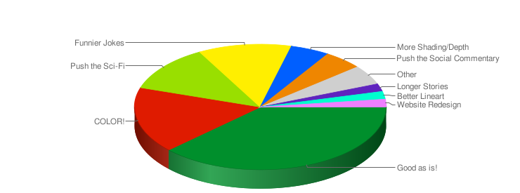
First off, a big THANK YOU to everyone who pitched in and offered up some advice for how to improve “The Zorphbert & Fred Experience”. I tried to come up with every possible way to improve a webcomic… except, long after I posted the poll, I realized I should have added “reader interaction” as it’s an important ingredient being online. Ah well. Anyway, here’s the results:

As much as I appreciate the majority of the response giving me a thumbs up on everything, I am a perfectionist and always looking for a way to improve. Thus, I will take the next couple higher ranking suggestions. After this storyline ends, I will attempt full color again… see if I can work out a compromise to save myself time to do each comic in color. I will also pay more attention to the sci-fi aspect of the comic (spice up storylines with that kind of thing), and work harder on better punchlines.
Thanks again for your opinions, they are greatly appreciated. Together with my readers’ help I hope to take Z&F to new levels. This right here, is what makes webcomics a terrific medium, and a definite PRO compared to traditional “ancient” newspaper comics.
You’ll note there is a brand new poll up now, so get to it! ;0)


Here’s my 2-cents, and it’s not worth even that… so take it for what it’s worth! 🙂
Try to simplify your backgrounds when you can. I know sometimes we have to put in a ton of stuff, but take a clue from Chuck Jones… his backgrounds were wonderfully simple (Road Runner cartoons were nothing but rocks, cactus & horizon mostly). It’s an evil trap, but most time I find comic artists put in so much into the background it distracts from the foreground.
I myself am the opposite, I don’t put in enough details sometimes. Be lazy like me. 🙂
I do think my work gets too busy… as I tend to mention in my comments. I agree too much background detail can distract from the characters. But I have also gotten the criticism that my artwork lacks depth… so I need to find a way to simplify my backgrounds w/o losing depth. Hmmm.. tough one. Thanks for your suggestions Byron!
I really like that you’re always looking for feedback and and keeping things evolving. Great philosophy to live by. Best of luck, can’t wait to see the upcoming color comics.
Thanks Matt! In the words of one of my favorite illustration professors: “Don’t ever get comfortable.” Artists grow, they experiment.. that’s what makes them artists, not robots. Now, not that I would call comic strips “high/fine art” per say, it does require some consistency .. but even the best cartoonists have shown growth over the years, both in writing and art.